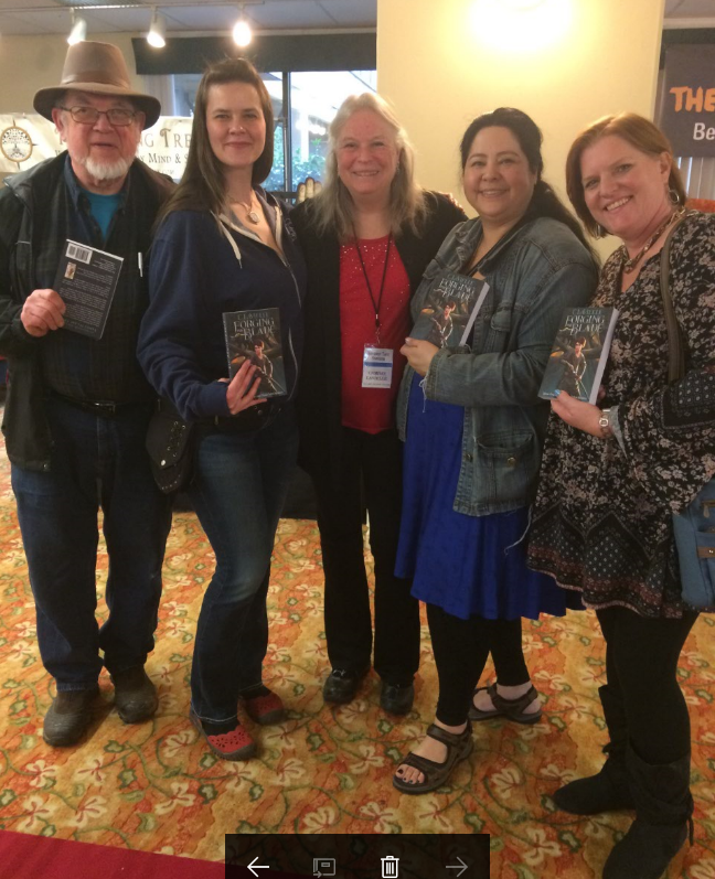
Thank you to everyone who stopped by my table at the NW Tarot Symposium
So great to see everyone!
I sold some books.
Did some healings.
Read some cards.
Met some amazing people.
And had a marvelous time.

So great to see everyone!
I sold some books.
Did some healings.
Read some cards.
Met some amazing people.
And had a marvelous time.
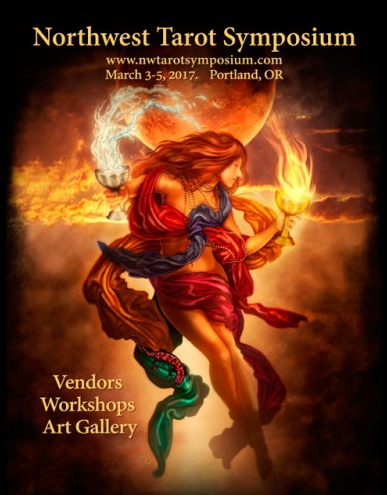
I’ll be there doing tarot readings and chakra cleansings.
Forging the Blade will be available for purchase.
March 3rd-5th
At the Monarch Hotel and Conference Center
12344 SE 93re Ave
Clackamas, OR 97015

When I began writing Forging the Blade, the concept of character development was a total mystery to me. All I knew was that I had this teen- age girl in my head that wouldn’t go away, but steadfastly refused to give me any helpful hints about who she was. When I would ask, all I got was a petulant, “You know who I am, write the freakin’ book.”
Our twin boys had just graduated from high school, and I had watched, listened, and learned as they went from freshmen to seniors. Fortunately they were (and still are) bright, adventurous, active, and healthy. But they are also impulsive, assertive, quick tempered, and tend to assume that the world revolves around them. OK, this is a personality type that I knew and had been dealing with for years. Could I make Molly—that was definitely her name— a female version of my kids?
“Yes,” she replied, “I’m like them, but I’m not them.”
Fair enough. Todd and Ian are like each other, but they are definitely not each other.
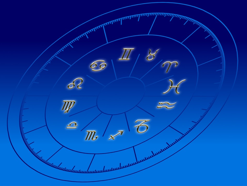
And then my astrology brain kicked in. I realized that the best way to envision 3 people who were like each other but not each other was to give them all the same chart, or at least the same sun, moon, and ascendant. These are the three biggies in any natal chart.
Molly, Ian, and Todd have:
The three together make for an exuberant optimism coupled with a very rare, but vicious temper that passes quickly with no grudges held.
As an astrologer, I know these things about Molly, and when she’s faced with a situation, she must react within these parameters or she’s not being herself.
In other words, keeping her sun, moon, and ascendant in mind helps me keep her character consistent.
I’ve also done this with the other main characters in Forging the Blade:
Asmodius: Scorpio sun and moon, Leo ascendant
Estelle Adair: Capricorn sun, Scorpio moon, Libra ascendant
Tamerlane: Virgo sun, Capricorn moon, Aries ascendant
If you look up the description of each sign and put it in the context of each character’s sun, moon, and ascendant and it will tell you quite a bit about that character.
Or better still, do this for your own sun, moon, and ascendant.
It will help you understand yourself.

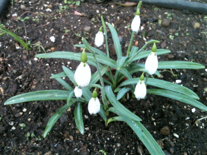
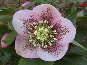
My snowdrops are in bloom and the hellebores are coming up.
Spring is coming.
Really it is!
I wrote this post as a guest writer for Malcolm Campbell.
So drop on by Malcolm’s Round Table and check it out!

Yay!!!
Happy dance.
Yes Yes Yes. Air punches.
My baby is finally out in paperback.
The cover was what was holding things up. Two months ago the first proof came back and the cover was too dark. The beautiful teal blue at the base was a murky blue grey. After two weeks and another round of proofs, CreateSpace’s phone consultants finally were kind enough to tell me that CreateSpace can’t/won’t make changes to my pdf file. I needed to make the changes. This is an important piece of info for anyone uploading their book to CreateSpace. They do not want responsibility for changing your files. All CreateSpace does, and all you are paying them to do, is create a book from the file that you give them.
So I emailed my illustrator, Ture Ekroos, and asked if there was anything she could do. There was and she did it and sent the new file to my graphic designer, who built up the cover from the new illustration. When it was ready, I uploaded it to CreateSpace, but forgot to check it in the digital proofer before I ordered a hardcopy proof. Big mistake. Always check the digital proof. In this case it wasn’t right. It would have saved me time if I’d caught it then.
The color was much better in the new proof, but there was a curious stair-stepping effect over Molly’s legs at the base of the cover and the whole thing was misaligned.
Much wailing and gnashing of teeth.
My graphic designer got the error corrected. From what CreateSpace told me, they actually went in themselves and corrected a sizing error. I’m still not sure what really happened, but I ordered another proof.
And Voila! It looked great.
And now, FORGING THE BLADE is ready for you to read in paperback!
I hope you enjoy it!
Oh–and reviews on Amazon would be most appreciated. 😉
I’m so excited to have this out in time for a cozy holiday read or last minute gift.
Enjoy.
The paperback version will be out soon on Amazon and at a Portland bookstore near you. I’ll let you know who has them when they’re actually in the store.
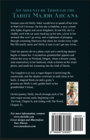

The front cover of a book is all glam. It’s what catches the reader’s eye and pique’s their curiosity. The back cover, however, is all business. On a trade paperback, which is what Forging the Blade will be, the most noticeable element is the blurb, one of the most difficult things an author ever writes. It usually begins as rewrite after rewrite of query letters to agents and is later distilled down to its essence for the book cover. In a few, screaming sentences it must tell enough about the book to convince someone that they really want to read it; but it must never give away the ending and or get tangled up in too much plot. Trust me, it’s an excruciating exercise. I can’t even begin to count the number of rewrites my cover blurb went through.
I chose to include a tarot card to give color and interest. This is where I learned about copyrights. Even though the most popular tarot decks were first created in 1910 ( the Rider Waite Smith deck) and the 1400’s (the Marseilles decks) and should be in public domain, they aren’t. The card companies that produce them are constantly brightening, re-coloring, and sharpening their lines, and with each change, they buy a new copyright. So I was unable to use them for the cover. Mike Howard, a friend and tarot historian, found me a picture of The Fool from a Marseilles deck produced in the 18th century by Francoise Chosson. It was definitely in public domain, but another friend, who is a patent lawyer, was quick to point out that the image of the card was created by someone and is therefore copyrighted. Fortunately the image was in Taropedia, a marvelous website full of hundreds of fabulous tarot images. In their instructions to their contributors they state unless an image is specified as being copyrighted, all images on their site are copyright free. I am fond of the Chosson Fool and was overjoyed that I had, at last, found a tarot image I could use.
In the lower left corner I mention my website and contact info and give credit to Ture Ekroos, my front cover illustrator and designer.
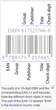
Which brings us to that black-and-white striped box in the lower right corner. It contains a barcode for the book’s thirteen digit ISBN (International Standard Book Number). If you want to sell your book, have it in libraries and listed in books in print, this number is a must. If you scan an ISBN, it will tell you the book’s country or geographical region/group, title, edition, publisher and includes a check digit to validate the number. When a book is published in a different size or format, or as an e-book, or as an audio book it must have a new ISBN. The barcode also gives the book’s suggested retail price, but that’s not part of the ISBN.
CreateSpace will give you a free ISBN, but if you ever change publishers you will need to buy another one. I decided it was better and safer to just purchase my own ISBN and copyright (yet another hassle), so I bought ten numbers from Bowker, the official ISBN Agency for the U.S. and its territories and Australia. It took me several hours and much frustration to complete the process, but I’m a spaz when it comes to filling out forms. I purchased a copyright from an app that Bowker sells called CopyrightsNow. The process was confusing and many of the questions were in translated legalese, but, with help, I was able to complete the form, upload the manuscript, and file it with the Library of Congress.
Because I bought my own ISBN, CreateSpace cannot make my books available to libraries. For me, this is a huge problem. I love libraries, and want to have my book in as many of them as possible. This way anyone can read it. Also, most brick and mortar bookstores will not buy from CreateSpace, which is a subsidiary of Amazon. This is partly on principal, but mostly because CreateSpace has a no return policy. I am actually content with this, because I (the publisher) would be the one paying CreateSpace (at my cost) for all those returned books. The other problem is that CreateSpace will help you upload your book to Kindle, but not to any other e-books.
 To remedy these problems, I will be using Ingram-Sparks as a second distributor. They will make Forging the Blade, (in hard copy and e-books) available to libraries; and brick-and-mortar stores will buy from them. However, I will indicate “no returns” on my distribution specifications until I have a bit of money in my book account to cover returns, and then I will switch the specs to “returns”.
It took a ton of research to figure all this out. There are books on self-publishing, which I should have read. It probably would’ve made this whole process much easier. I did ask the Multnomah County Library information service about how to self-publish hard-copy-books and e-books that libraries can buy. The answers and web links they sent were excellent and made my life so much easier.
So, the upshot of all this is that Forging the Blade will be available soon on Amazon and Kindle, and then at a few Portland, Oregon bookstores, and then, through Ingram-Sparks, more brick-and-mortar stores and libraries throughout the US, Europe, and Australia.
Of course we all know we shouldn’t judge a book by its cover, and of course we all do. We can’t help it. We pick up a book and there’s the cover, giving us a picture, a glimpse, into the pages and pages of the story that we are considering spending hours of our limited time reading. We grasp at every clue we can to decide whether that time and money will be well spent.
A good cover is really important. It’s actually in CreateSpace’s list of factors that determine how well a book sells.
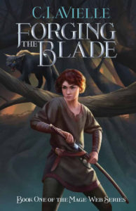
I considered having a friend, who is a graphic designer, put together a collage type cover for me and she came up with some marvelous designs. The problem was that she couldn’t find a picture that came close to what my main character looks like, and since YA fantasy is totally character driven, it’s important to give the reader an image to take with them into the story.
I was whining to a friend about finding the extra money pay an artist to draw a book cover with a picture of Molly, my main character, on it, and she was quick to correct me. “No, no,” she said. “You don’t want an artist, you want an illustrator. An artist draws their vision and an illustrator draws your vision.
 So where do you find an Illustrator? On the web, of course! There are lots out there, and they have websites full of their artwork. I looked and looked and found four artists that I really liked. One hired out through an agency, and their contract essentially said that I couldn’t use the art for anything but the actual book cover, and I wanted to use it in my advertising. That wouldn’t work. One illustrator was swamped with work and wasn’t taking new clients, and one was asking for more than I could afford to pay. Ture Ekroos, a Finnish professional animator, agreed to do the work at a price I could afford (she has a special rate for self-publishing authors) and gave me full rights to the artwork I bought.
And she is a wonderful illustrator.
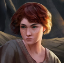
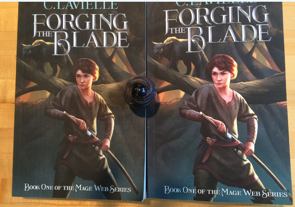
I asked her to draw Molly (short, curly, auburn hair, freckles) seated in the woods holding her sword and Asmodius, her guide who is a mage and a black cat, in the foreground.
The image didn’t work.
It was too static, and Molly’s face was all wrong, and Asmodius looked way too sweet. Fortunately, she works on a computer, so changes are easy. My friend, the graphic designer, said “Write her back and tell her exactly what you want. Every last detail.”
I decided I wanted Molly to be drawing her sword in response to a threat (not shown) and Asmodius also in fighting mode. I wanted Molly to look fierce and determined and googled images of fierce, determined women to show Ture so she’d know exactly what I was looking for. It’s surprisingly difficult to find women with fierce, determined expressions, but I found a few. And then there was the problem of her sword. Molly’s sword looks and is used a lot like a Japanese katana. I have several friends who are martial artists and they insisted that the form should be correct. I sent Ture pictures of katanas, how samurais wear them in their belts, and how they stand when they are drawing them.
Ture listened to what I wanted and drew it. After several emails back and forth, we arrived at this image.
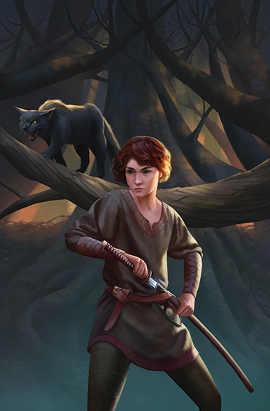
We also needed to find a font for the title and author. I looked at a bunch of YA fantasy covers and noticed that over 90% of the titles were in modern Gothic fonts in screaming caps. Since I wanted my book to look like a YA fantasy (because it is one), I asked Ture if she would do the graphics like this. And she did.

Is this a cool front cover or what?