
 Of course we all know we shouldn’t judge a book by its cover, and of course we all do. We can’t help it. We pick up a book and there’s the cover, giving us a picture, a glimpse, into the pages and pages of the story that we are considering spending hours of our limited time reading. We grasp at every clue we can to decide whether that time and money will be well spent.
A good cover is really important. It’s actually in CreateSpace’s list of factors that determine how well a book sells.
I considered having a friend, who is a graphic designer, put together a collage type cover for me and she came up with some marvelous designs. The problem was that she couldn’t find a picture that came close to what my main character looks like, and since YA fantasy is totally character driven, it’s important to give the reader an image to take with them into the story.
I was whining to a friend about finding the extra money pay an artist to draw a book cover with a picture of Molly, my main character, on it, and she was quick to correct me. “No, no,” she said. “You don’t want an artist, you want an illustrator. An artist draws their vision and an illustrator draws your vision.
 So where do you find an Illustrator? On the web, of course! There are lots out there, and they have websites full of their artwork. I looked and looked and found four artists that I really liked. One hired out through an agency, and their contract essentially said that I couldn’t use the art for anything but the actual book cover, and I wanted to use it in my advertising. That wouldn’t work. One illustrator was swamped with work and wasn’t taking new clients, and one was asking for more than I could afford to pay. Ture Ekroos, a Finnish professional animator, agreed to do the work at a price I could afford (she has a special rate for self-publishing authors) and gave me full rights to the artwork I bought.
And she is a wonderful illustrator.
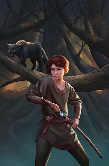
I asked her to draw Molly (short, curly, auburn hair, freckles) seated in the woods holding her sword and Asmodius, her guide who is a mage and a black cat, in the foreground.
The image didn’t work.
It was too static, and Molly’s face was all wrong, and Asmodius looked way too sweet. Fortunately, she works on a computer, so changes are easy. My friend, the graphic designer, said “Write her back and tell her exactly what you want. Every last detail.”
I decided I wanted Molly to be drawing her sword in response to a threat (not shown) and Asmodius also in fighting mode. I wanted Molly to look fierce and determined and googled images of fierce, determined women to show Ture so she’d know exactly what I was looking for. It’s surprisingly difficult to find women with fierce, determined expressions, but I found a few. And then there was the problem of her sword. Molly’s sword looks and is used a lot like a Japanese katana. I have several friends who are martial artists and they insisted that the form should be correct. I sent Ture pictures of katanas, how samurais wear them in their belts, and how they stand when they are drawing them.
Ture listened to what I wanted and drew it. After several emails back and forth, we arrived at this image.
We also needed to find a font for the title and author. I looked at a bunch of YA fantasy covers and noticed that over 90% of the titles were in modern Gothic fonts in screaming caps. Since I wanted my book to look like a YA fantasy (because it is one), I asked Ture if she would do the graphics like this. And she did.
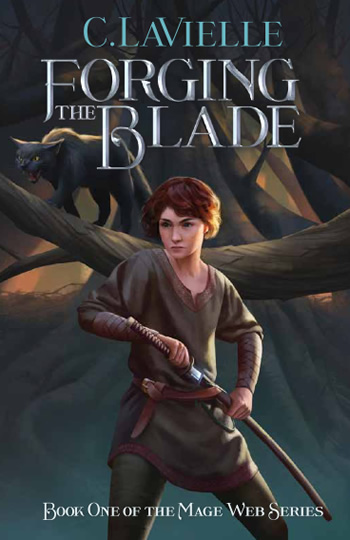
Is this a cool front cover or what?
6 thoughts on “Self-publishing: The Front Cover”
Looks good. I’m glad you found an illustrator you could work with and ultimately reach the look you wanted.
How cool. Glad to know this distinction between artist and illustrator. It makes sense.
Looks great! So exciting that you’re getting so close!
Love it. Trucking Yogi can’t wait to review it in her blog!
Namaste’
Beautiful cover and thank you for the info on getting help with a cover.
Glad to help!